


Mental health care is rarely a straight line. From the client’s perspective, it often spans many months, sometimes years, across different services and care settings. For clinicians and case managers, maintaining continuity of care across this timeline, and being able to quickly and visually understand a client’s history at a glance can be incredibly challenging.
This challenge is especially pronounced in busy environments where time is short, and decisions need to be made quickly. Having a clear, consolidated view of a person’s journey can also become a valuable tool in the triage process, helping teams identify existing clients, recognise those at risk, and better understand needs right from the point of registration.
In Victoria, much of this information is captured in the state-wide CMI (Client Management Interface) platform. While CMI holds a wealth of valuable data, it can be difficult to pull together a coherent, end-to-end picture. Reports often live in separate places, requiring clinicians and managers to piece together contacts, episodes, outcome measures, legal statuses, and safety events across multiple systems.
Over time, this can create gaps in understanding: when exactly did the consumer transition between care types? How have their outcomes shifted across episodes? When did critical events occur in relation to treatment or legal orders? These are the types of questions that clinicians need to answer quickly in order to plan effective care.
This challenge came through clearly in our conversations with mental health services: the need for a clearer, more intuitive way to visualise the full consumer journey. Not just as static data points, but as a connected, meaningful story.
A New Lens on the Patient Journey
Within our mental health analytics platform, Kalon, our team, led by Siva Sooryan developed a Patient Journey Dashboard in Power BI to help address this challenge. Drawing directly from CMI data, the dashboard presents a longitudinal view of care in a single, integrated visual, making it easier to grasp the full context around a person’s experience in the mental health system.
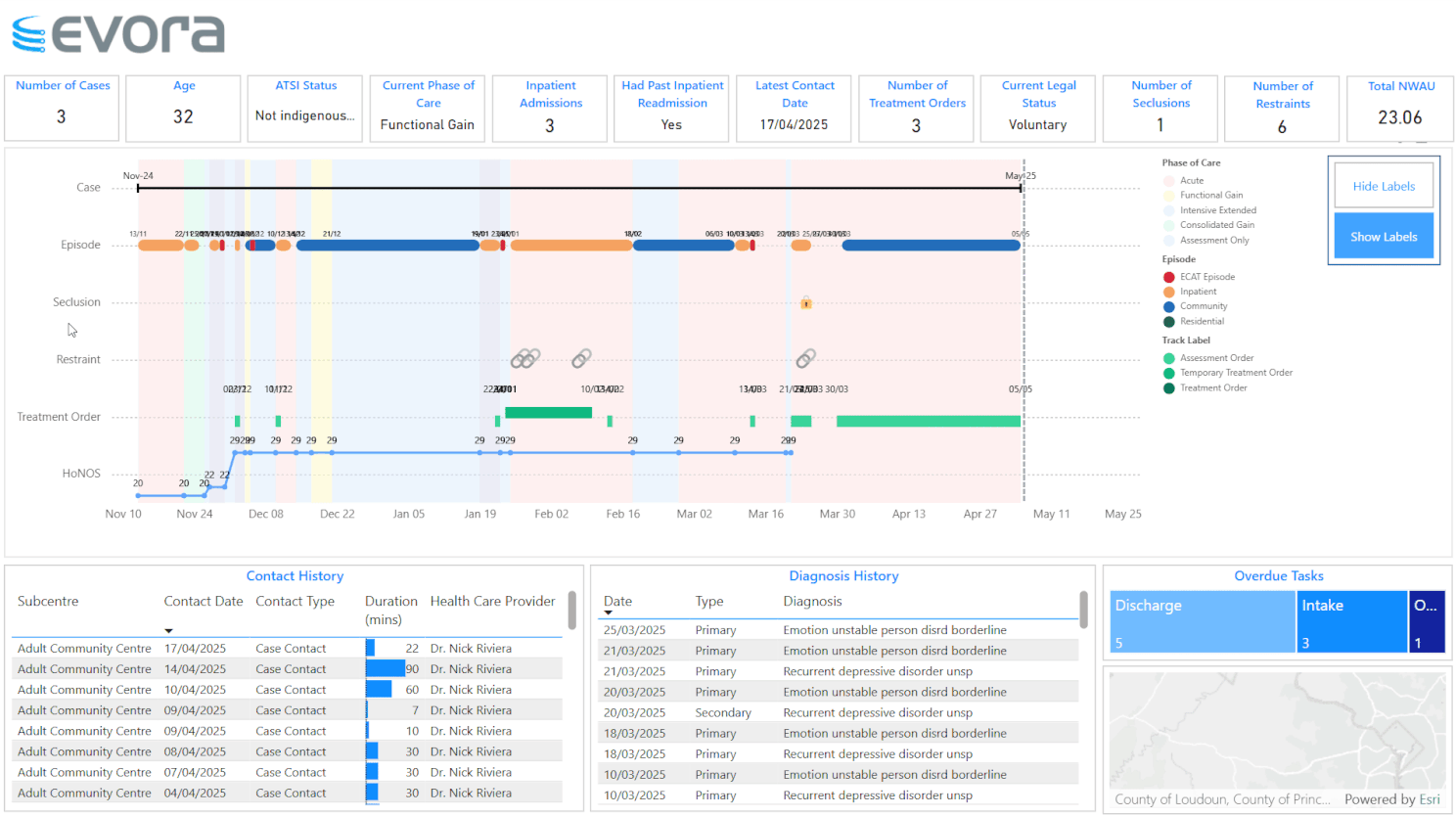
Here’s what it offers:
- Clear timeline of cases and episodes: Start and end dates are laid out across care types such as ECAT, inpatient, community, and residential, helping teams understand where a person has been and when transitions occurred. This reduces the need to cross-check multiple systems or reports and saves time in clinical handovers and reviews.
- Phases of care mapped over time: Distinct clinical phases, from acute care to functional gain and assessment, are colour-coded and layered across the timeline. This gives clinicians an immediate sense of the focus and intensity of care at different points — which can be particularly helpful when reviewing a long history or multiple episodes.
- Seclusion and restraint events visible: These critical safety events are clearly marked, providing a basis for reflection on patterns of escalation or crisis. Clinicians and leaders can use this information to think about where interventions might be strengthened or where changes in practice might reduce risk.
- Treatment and assessment orders tracked: The visual includes the type and duration of treatment orders, supporting clinical teams in maintaining oversight of both clinical and legal aspects of care. This helps ensure that treatment plans remain aligned with legal frameworks and that important review dates are not missed.
- HoNOS outcomes charted as a line graph: Outcome scores are presented in a line chart, making it easier to track improvement or decline over time. By aligning these scores with phases of care and treatment changes, clinicians can gain insights into what’s working, what’s not, and where additional support may be needed.
Designed for Practice, Not Just Reporting
The development of this dashboard was shaped by ongoing discussions with clinical teams, managers, and data specialists. A key principle was ensuring that the visual supported day-to-day practice. Not just reporting or compliance.
For case managers, the dashboard offers a practical tool to inform care planning, case conferencing, and handover discussions. For clinical leaders, it enables reflective practice, supports incident review, and provides a clearer picture of patterns across the service. For health services more broadly, it helps track progress on key outcomes and informs quality improvement efforts.
Throughout the design process, technical expertise was paired with clinical insight — an approach that benefited enormously from Siva Sooryan's work, who helped translate clinical needs into a custom technical solution.
“Designing the patient journey involved the technical challenge of integrating data from different parts of the mental health care process into a clear, accessible format. The focus was on creating a visual that was not only easy to interpret but also added meaningful value by combining business logic and technical execution to reveal new perspectives on existing data.” - Siva Sooryan
The result is a dashboard that aims to balance simplicity and depth, making complex data easier to understand and apply in real-world settings.
Looking Ahead
As mental health services face increasing demand and rising complexity, the ability to connect data meaningfully to practice is becoming more important than ever. Tools like the Patient Journey Dashboard offer one example of how existing data — when thoughtfully designed and presented — can support better, safer, and more coordinated care.
Rather than adding new data requirements, the focus here has been on making the most of what’s already available in systems like CMI. By presenting this information in a consolidated, clinically relevant way, services can free up time for frontline work, improve oversight, and ultimately help deliver more person-centred care.
Summary
This article is intended to share insights with the broader health community on how we’ve approached visualising the mental health patient journey, in the hope that it’s useful or thought-provoking for others working in this space.
If you’re interested in learning more about our mental health analytics platform, Kalon, or would like to explore how your organisation could develop its own approach to visualising and using this kind of data, feel free to reach out. We’re always open to conversations about improving how data supports clinical care.
Written by Bernard Herrok, proofed by AI.
Our Partners
.png)


Contact us


